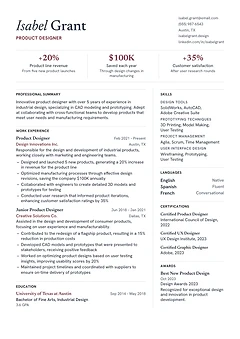
Atelier: Senior resume template
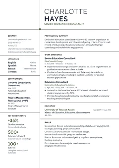
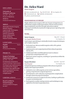
Serif type, a wine accent and three headline figures under your name, beside a wide career column. Suits product designers.
Home / Templates
One and two column designs, with or without a photo. Every design takes your theme colour and lets you switch section layouts, so you can change your mind after you start.
Change the design at any time. Your content moves with you.
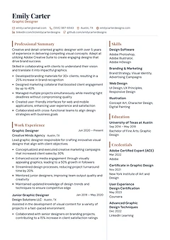
Serif type, a wine accent and three headline figures under your name, beside a wide career column. Suits product designers.
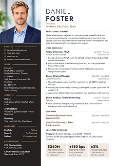
A full-height dark column with your photo edge to edge at the top and a spaced capital name. Suits finance directors and executives.
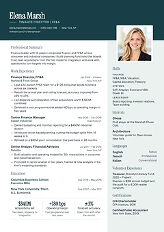
A deep petrol band with a large serif name and a photo straddling it above a tinted side column. Suits finance and business leaders.
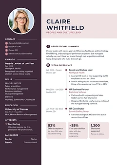
A plum sidebar with your photo, a name band, icon headings and a timeline of roles. Suits HR, people and culture leads.
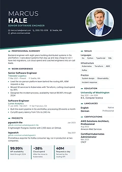
A slanted dark header with your photo in a ring, key figures on tiles and a skills column. Suits software and engineering roles.
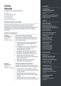
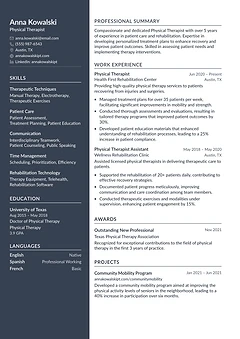
A career column with employers and dates on a side axis, next to a charcoal column for skills and credentials. Suits sales leaders.
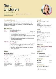
A yellow cover band with your name over two lines, your photo on a rose disc and key figures in rings. Suits brand and visual designers.
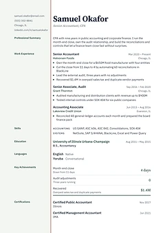
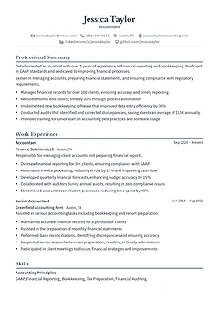
Section labels in a pale margin closed by a double rule, like a ledger page, with key figures under a ruled total. Suits accountants.
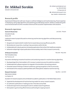
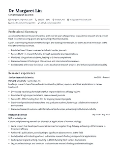
A research CV that lists research experience, numbered publications and education. Suits AI researchers and other scientists.
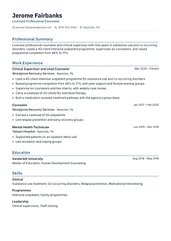
One column with fine rules, coloured headings and grouped skills. Suits counsellors, clinicians and technical professionals.
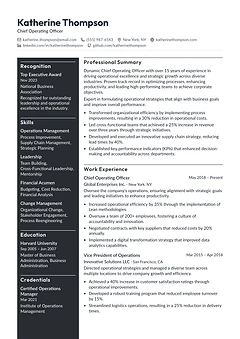
A full-width name over a charcoal leadership sidebar and a wide career column. Suits COOs, directors and senior managers.
A centred name, aligned dates and compact credentials in one column. Suits accountants, auditors and compliance roles.
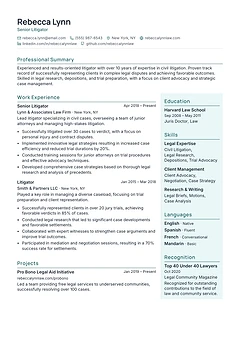
A full-width profile above a career column and a pale teal side column for education and skills. Suits litigators and senior advisers.
A research record that puts publications and academic training first. Suits scientists, researchers and academics.
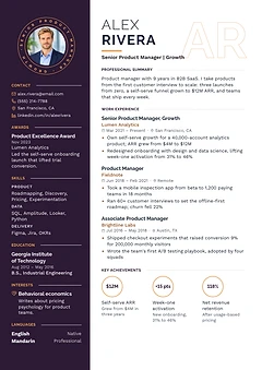
A dark sidebar with your photo in a ring, outlined initials behind your name and key figures in circles. Suits product managers.
An asymmetric serif header and a skills column grouped by discipline. Suits graphic designers, illustrators and creative roles.
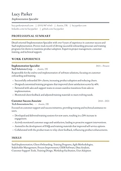
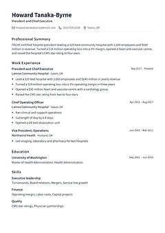
Plain monochrome type in one clear column, most recent role first. Works for any profession, from a first job to chief executive.
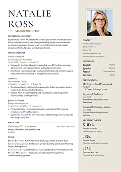
A large serif name and a sand side column with your photo, contacts and key figures. Suits architects and design-led professionals.
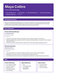
Each section is a bordered card under a colour banner, with skills in three boxes side by side. Suits product marketing and digital roles.
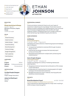
Two fine lines cross the page, with your photo on the vertical line and your name beside it. Suits art directors and designers.
Fine black lines divide the page into cells, with key figures in a narrow left column. Suits consultants, architects and planners.
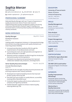
A wide career column beside a pale side column for education, skills and certifications. Suits quality, operations and engineering managers.
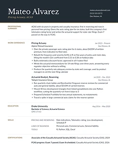
A charcoal masthead with a serif name and a brass rule, and section labels in the margin. Suits actuaries and finance specialists.
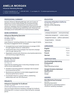
A full-width colour banner carries your name and contacts above two columns. Suits marketing, media and communications roles.
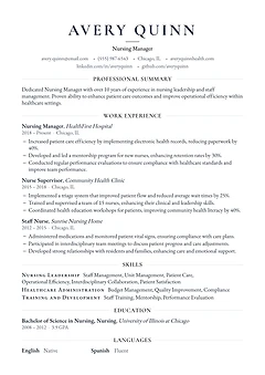
One column with a centred serif name and small-caps headings. A quiet, classic page for nursing, teaching and public sector roles.
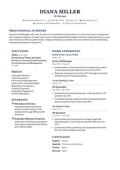
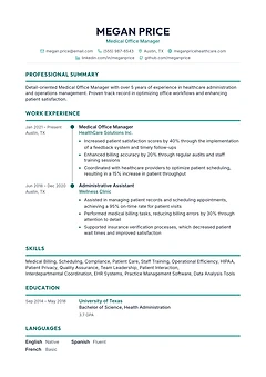
A centred serif name over two columns: education and skills on the left, experience on the right. Suits HR and people managers.
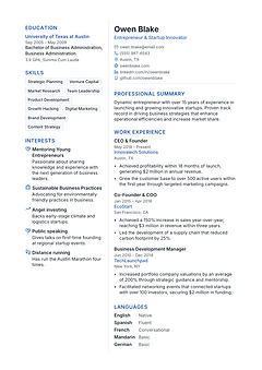
A narrow left column with skill tags and interests beside a wide column for your career. Suits founders, product people and engineers.
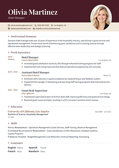
A deep colour header with an oval photo, serif italic headings and a date column. Suits hotel, finance and consulting managers.
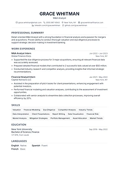
A black-and-white single column with a centred name and a skill grid. A safe default for finance, analyst and graduate roles.
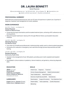
A centred name, dates on their own line before each role, and education and skills side by side. Suits doctors and senior clinicians.
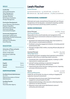
A tinted left sidebar for skills, education and certifications beside a wide experience column. Suits teachers and school leaders.
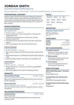
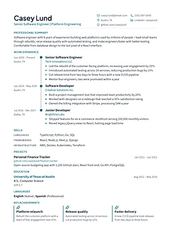
An accent stripe under each heading, with experience on the left and achievements and skills on the right. Suits software engineers.
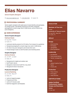
A large coloured name and a bold side column for skills, tools and education. Suits graphic designers and other creative roles.
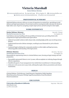
Every element is centred in a formal serif layout, from the name to the headings. Suits lawyers, the public sector and conservative fields.
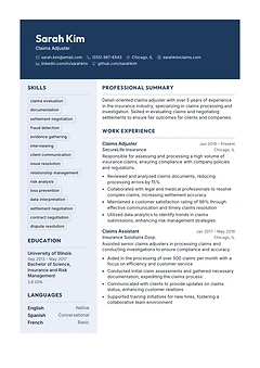
A dark header band with your name over a left column of skills and a wide experience column. Suits insurance, claims and operations roles.
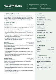
A colour header band over a wide experience column, with a tinted side column for skills and certifications. Suits accountants.
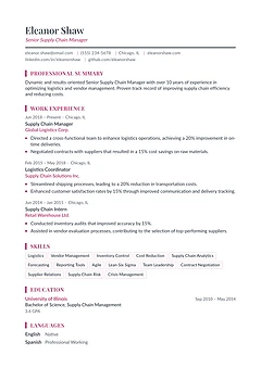
One column with a light serif name, rose headings and short skill tags. Suits supply chain, operations and HR managers.
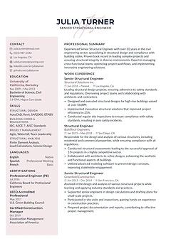
A centred name over script initials, a blush side panel and compact type that fits a long career on one page. Suits engineers.
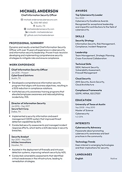
Experience set as shaded blocks beside a light column for awards, skills and education. Suits technology and security leaders.
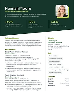
A slanted colour header with your photo and three headline figures above two columns. Suits PR, marketing and product people.
A single serif column with an italic name, gold rules and generous spacing. Suits writers, editors and client-facing specialists.
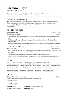
A single serif column with ruled headings and a compact skill grid. Suits business, finance and product roles.
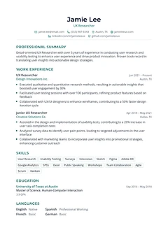
One airy column with a centred name, coloured headings and skill tags. Suits UX, research and early-career roles.
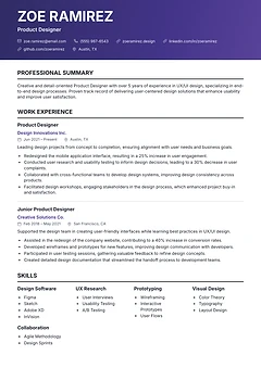
A gradient banner holds your name above one clean column, with skills in four short groups. Suits product designers and UX roles.
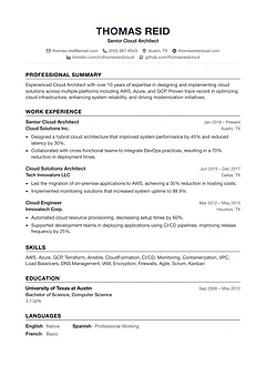
Plain black type, a centred name and thin rules. A no-frills single column that suits engineers and almost any other field.
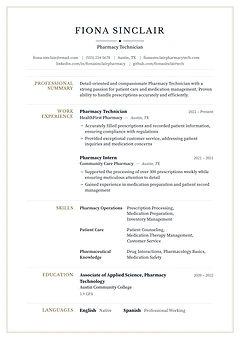
A framed page with a centred serif name and section labels in the left margin. Suits pharmacy, healthcare and other regulated roles.
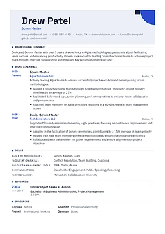
A tinted header plate with a corner mark, square-marked headings and a year column. Suits project managers, engineers and architects.
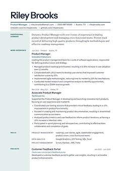
A large display name over a ruled dateline, with section labels in a tinted margin. Suits product managers and communicators.
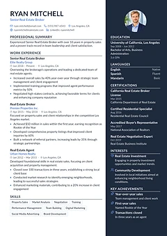
A dark side column holds your photo, achievements and licences, next to a white column for experience. Suits sales and real estate roles.
One column built around a career line, with each role as a milestone and key achievements in a row. Suits engineers.
A dark full-height sidebar with serif type beside a light career column. Suits surgeons, consultants and senior specialists.
A dark left sidebar takes your name, contacts, skills and education, so the main column holds more experience. Suits clinicians.
A centred name and a vertical timeline linking each role, with dates on the left. Suits careers with steady progression.
Five questions settle most of it. Each answer filters the gallery above.
How much experience do you have?
Under about 10 years usually fits one page.
Will a person or hiring software read it first?
Large employers and job boards often screen with software.
One column or two?
Two columns fit more; one column reads most simply.
Photo or no photo?
Common in parts of Europe and Asia, usually left out in the US, UK and Canada.
How formal is your field?
Law, finance and government lean traditional; design and media allow more colour.
Designs we read back as text to check the reading order, headings and contact details.
Three designs for each look and layout. Every one takes your theme colour.
One column, plain headings and plenty of white space.
A colour accent, a clear header and room for skills.
Quiet layouts with a side column, for office and management roles.
Serif type and a formal order, for law, finance and the public sector.
Bolder colour and shapes, for design, media and marketing.
Everything in one reading line, top to bottom.
Skills and contact details beside your experience.
A space for a headshot, where a photo is expected.
Education and projects near the top, for a first or second job.
Room for a long career, key results and leadership roles.
The format is the order your experience appears in, separate from the design.
Each field's example pages show the templates we picked for those roles, with a finished resume in each one.
The one that puts your strongest material where a reader looks first. For most people that is a one-column design with clear headings and dates lined up on the right. If you apply through online job portals, start with the ATS-friendly designs. If you have a long career, a two-column design fits more on the page. You can switch designs at any time without retyping anything.
Designs marked ATS-friendly passed our read-back check: we turned each one into plain text and confirmed that the name, contact details, headings, jobs and dates came out whole and in order. Most two-column designs here pass too. If you are applying through an older system that reads straight across the page, a one-column design is the safest choice. The ATS-friendly templates page lists every design that passed. See ATS-friendly resume templates
One page suits students and people with less than about ten years of experience. Two pages is normal for longer careers, senior roles, and jobs that list publications or licences. Either way, the first page should carry your best material: your current role, your main results and your core skills. If you run slightly over, Fit to one page in the editor tightens the spacing for you.
In the US, Canada, the UK and Australia, leave it off. Recruiters there rarely expect one, and some employers remove photos to reduce bias. In much of Europe, the Middle East and Asia a photo is common. If you are not sure, follow the job advert or what is usual in that country.
In the US and Canada, a resume is a one or two page summary written for each job, and a CV is a full academic record of research, teaching and publications. In the UK, Ireland, India and much of Europe, "CV" simply means what Americans call a resume. These templates work for both. Scholar and Quarto have room for publications.
Yes. Your content is kept apart from the design, so switching templates keeps every section and line you have written. Your theme colour carries over, and you can still move sections and change their layout afterwards.
Pick a design now or upload the resume you have.