Atelier: Senior resume template
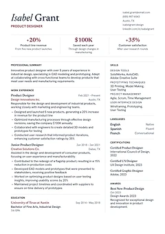
Serif type, a wine accent and three headline figures under your name, beside a wide career column. Suits product designers.
48 designs. Change the design at any time. Your content moves with you.
Serif type, a wine accent and three headline figures under your name, beside a wide career column. Suits product designers.
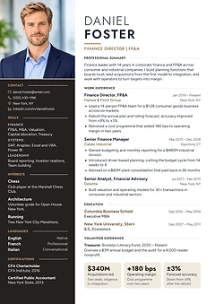
A full-height dark column with your photo edge to edge at the top and a spaced capital name. Suits finance directors and executives.
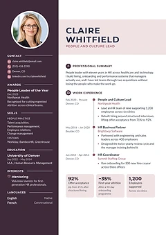
A plum sidebar with your photo, a name band, icon headings and a timeline of roles. Suits HR, people and culture leads.
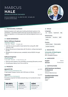
A slanted dark header with your photo in a ring, key figures on tiles and a skills column. Suits software and engineering roles.
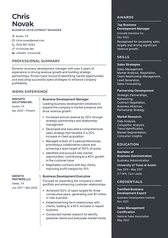
A career column with employers and dates on a side axis, next to a charcoal column for skills and credentials. Suits sales leaders.
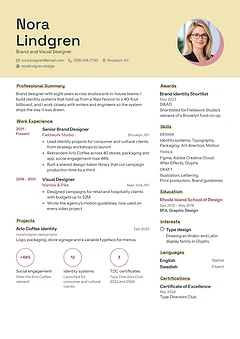
A yellow cover band with your name over two lines, your photo on a rose disc and key figures in rings. Suits brand and visual designers.
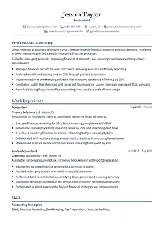
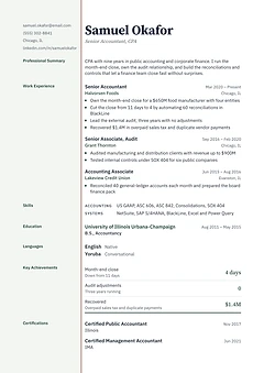
Section labels in a pale margin closed by a double rule, like a ledger page, with key figures under a ruled total. Suits accountants.
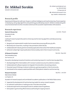
A research CV that lists research experience, numbered publications and education. Suits AI researchers and other scientists.
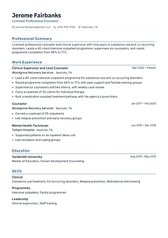
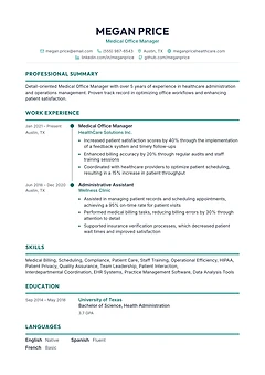
One column with fine rules, coloured headings and grouped skills. Suits counsellors, clinicians and technical professionals.
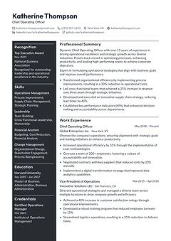
A full-width name over a charcoal leadership sidebar and a wide career column. Suits COOs, directors and senior managers.
A centred name, aligned dates and compact credentials in one column. Suits accountants, auditors and compliance roles.
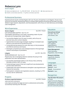
A full-width profile above a career column and a pale teal side column for education and skills. Suits litigators and senior advisers.
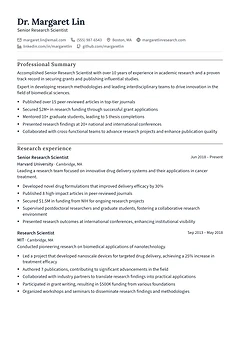
A research record that puts publications and academic training first. Suits scientists, researchers and academics.
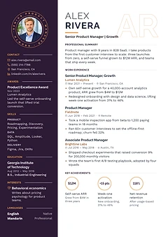
A dark sidebar with your photo in a ring, outlined initials behind your name and key figures in circles. Suits product managers.
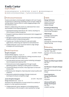
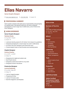
An asymmetric serif header and a skills column grouped by discipline. Suits graphic designers, illustrators and creative roles.
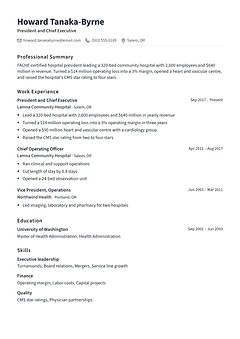
Plain monochrome type in one clear column, most recent role first. Works for any profession, from a first job to chief executive.
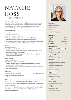
A large serif name and a sand side column with your photo, contacts and key figures. Suits architects and design-led professionals.
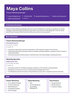
Each section is a bordered card under a colour banner, with skills in three boxes side by side. Suits product marketing and digital roles.
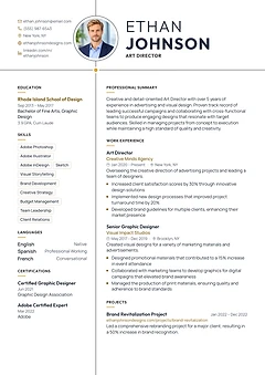
Two fine lines cross the page, with your photo on the vertical line and your name beside it. Suits art directors and designers.
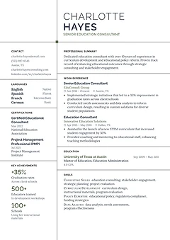
Fine black lines divide the page into cells, with key figures in a narrow left column. Suits consultants, architects and planners.
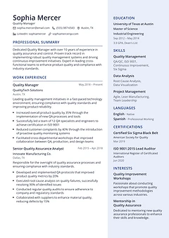
A wide career column beside a pale side column for education, skills and certifications. Suits quality, operations and engineering managers.
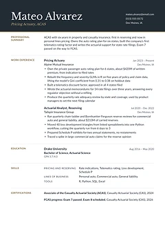
A charcoal masthead with a serif name and a brass rule, and section labels in the margin. Suits actuaries and finance specialists.
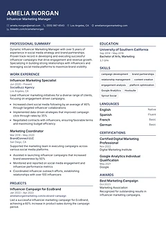
A full-width colour banner carries your name and contacts above two columns. Suits marketing, media and communications roles.
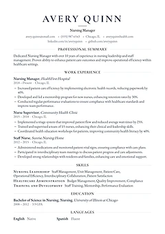
One column with a centred serif name and small-caps headings. A quiet, classic page for nursing, teaching and public sector roles.
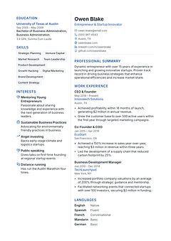
A narrow left column with skill tags and interests beside a wide column for your career. Suits founders, product people and engineers.
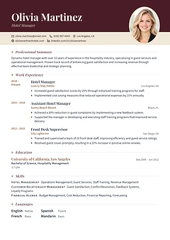
A deep colour header with an oval photo, serif italic headings and a date column. Suits hotel, finance and consulting managers.
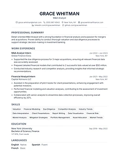
A black-and-white single column with a centred name and a skill grid. A safe default for finance, analyst and graduate roles.
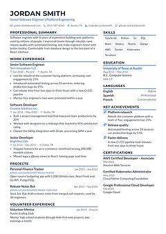
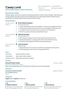
An accent stripe under each heading, with experience on the left and achievements and skills on the right. Suits software engineers.
A large coloured name and a bold side column for skills, tools and education. Suits graphic designers and other creative roles.
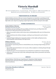
Every element is centred in a formal serif layout, from the name to the headings. Suits lawyers, the public sector and conservative fields.
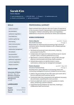
A dark header band with your name over a left column of skills and a wide experience column. Suits insurance, claims and operations roles.
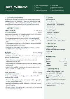
A colour header band over a wide experience column, with a tinted side column for skills and certifications. Suits accountants.
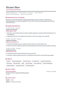
One column with a light serif name, rose headings and short skill tags. Suits supply chain, operations and HR managers.
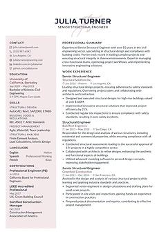
A centred name over script initials, a blush side panel and compact type that fits a long career on one page. Suits engineers.
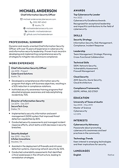
Experience set as shaded blocks beside a light column for awards, skills and education. Suits technology and security leaders.
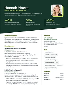
A slanted colour header with your photo and three headline figures above two columns. Suits PR, marketing and product people.
A single serif column with an italic name, gold rules and generous spacing. Suits writers, editors and client-facing specialists.
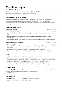
A single serif column with ruled headings and a compact skill grid. Suits business, finance and product roles.
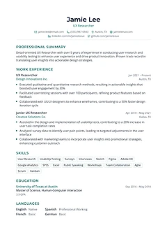
One airy column with a centred name, coloured headings and skill tags. Suits UX, research and early-career roles.
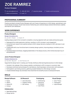
A gradient banner holds your name above one clean column, with skills in four short groups. Suits product designers and UX roles.
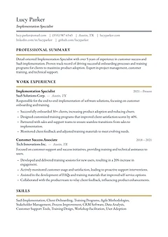
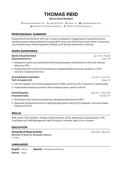
Plain black type, a centred name and thin rules. A no-frills single column that suits engineers and almost any other field.
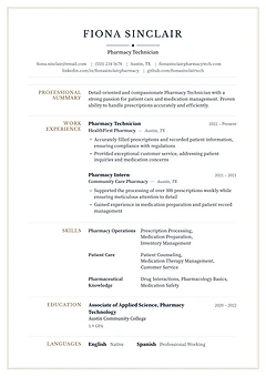
A framed page with a centred serif name and section labels in the left margin. Suits pharmacy, healthcare and other regulated roles.
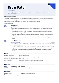
A tinted header plate with a corner mark, square-marked headings and a year column. Suits project managers, engineers and architects.
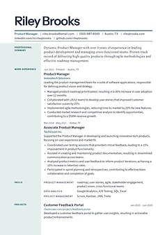
A large display name over a ruled dateline, with section labels in a tinted margin. Suits product managers and communicators.
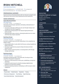
A dark side column holds your photo, achievements and licences, next to a white column for experience. Suits sales and real estate roles.
One column built around a career line, with each role as a milestone and key achievements in a row. Suits engineers.
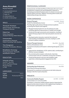
A dark left sidebar takes your name, contacts, skills and education, so the main column holds more experience. Suits clinicians.
A centred name and a vertical timeline linking each role, with dates on the left. Suits careers with steady progression.
An applicant tracking system (ATS) is the software many employers use to collect and sort applications. When you upload a resume, it pulls the text out of the file and fills in a candidate profile: name, email, phone, job titles, employers, dates, schools and skills. Recruiters then search and filter those profiles.
An ATS resume is one that survives that step. The software can find every part of it, so the profile matches what you wrote and your resume turns up when a recruiter searches for your skills. If a resume parses badly, it can still reach a person, but often with your jobs mixed together or your contact details missing.
Colours and layout matter less to a parser than where the text sits and what it is. Five things decide whether a parser reads a page correctly:
Use the reverse chronological format: your current or latest job first, then the ones before it, each with a job title, employer, location and dates. Every template on this page is built that way.
A typical order is contact details, a short summary, work experience, education and skills. Add certifications, projects or languages when the job asks for them. Write dates the same way throughout, such as "Mar 2022 – Present".
Send a PDF unless the job advert asks for a Word file. A PDF made from these templates holds real text, so a parser can read it, and it looks the same on every screen. A scanned page or a photo of your resume is an image, and most systems cannot read it.
Many are. Current parsers mostly read a two-column page one column at a time, so a sidebar of skills and contact details comes out as its own block. The two-column designs on this page passed when read that way.
Some older systems read straight across the page, line by line, and can mix the two columns together. If a company's application portal looks dated, or the advert asks for a plain or simple resume, choose a one-column design. You can switch at any time without retyping anything.
25 of the 48 designs on this page have two columns.
A quick test: open your PDF, select all the text and paste it into a plain text editor. If your name, headings, jobs and dates appear in a sensible order, a parser will most likely read them too. If text is missing or scrambled, the layout is getting in the way.
For a fuller check, the ClayCV resume checker reads a PDF or Word file the way a parser does and shows you what it pulled out. It checks the text layer, layout, sections and wording, then lists each problem with how to fix it. It runs on fixed rules, so the same file always gets the same score.
It makes sure the software can read your resume. It does not decide who gets an interview. Recruiters still search for skills, job titles and experience, so the words you use matter as much as the layout. Use the job advert's own terms for skills you really have.
A PDF, unless the job advert or portal asks for Word. Modern systems read text-based PDFs well, and a PDF keeps your layout the same for the recruiter. Avoid scanned PDFs and images.
No. In the UK, Ireland, India and much of Europe, CV is the usual word for what Americans call a resume, and the same rules apply. Every design on this page works as an ATS-friendly CV.
Yes, as long as the words are still text. Colour and a photo do not stop a parser reading the page. Icons are fine next to your email or phone, but not in place of them. Whether to add a photo depends on the country: leave it off in the US, UK, Canada and Australia.
Choose a one-column design if you are applying through many different job portals, or have less than about ten years of experience. Choose a two-column design if you have a longer career or many skills to list and want more on the first page. All of them can be switched later.
A few designs place text in a way that some parsers read out of order. They work well when a person reads them first, for example when you email your resume or hand it over at an interview, so they stay on the main templates page.
Pick a design now, or see all resume templates.